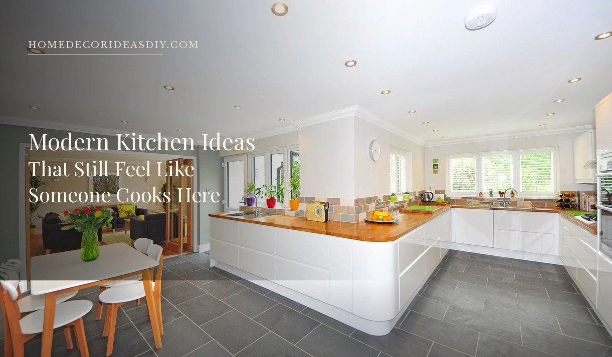
I have stood in more than one kitchen sold to me as modern and felt nothing. Clean lines. White everything. A tap that looked like it belonged on a boat. The owner would say “we went contemporary” and then apologise for the fruit bowl, as if a banana on the worktop had ruined the concept.
That is the trouble with most of the pictures. They are taken at seven in the morning with the kettle unplugged. Nobody lives like that. A kitchen has to take a wet chopping board, a school bag, last night’s glasses, and still look like someone meant it. If it only works empty, it is not modern. It is a stage set.
What a modern kitchen actually looks like now
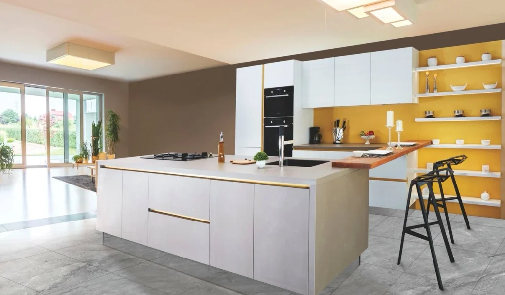
Five years ago “modern” meant pale grey, high gloss, and no visible handle if you could help it. That look is still around, and it still photographs well. It also shows every fingerprint and every splash of turmeric.
What has shifted is the room’s temperature. Wood has crept back onto the cabinets. Not the orange oak of the late nineties. Medium grain. A bit of warmth in the floor. Stone that is not blinding white. Designers have been saying this for a while, and the numbers finally caught up. In Houzz’s 2026 kitchen study, wood cabinets edged past white for the first time in years. Barely. Twenty-nine percent against twenty-eight. That is not a landslide. It is a room going slightly warmer because people got tired of cooking in a laboratory.
If you take one thing from that, take this: a modern kitchen can have colour. Sage on the base units. A darker island. Even a brown that looks like chocolate, if the rest of the room stays quiet. The old rule that modern equals white is just habit.
Start with the cabinets. That is what people see first.
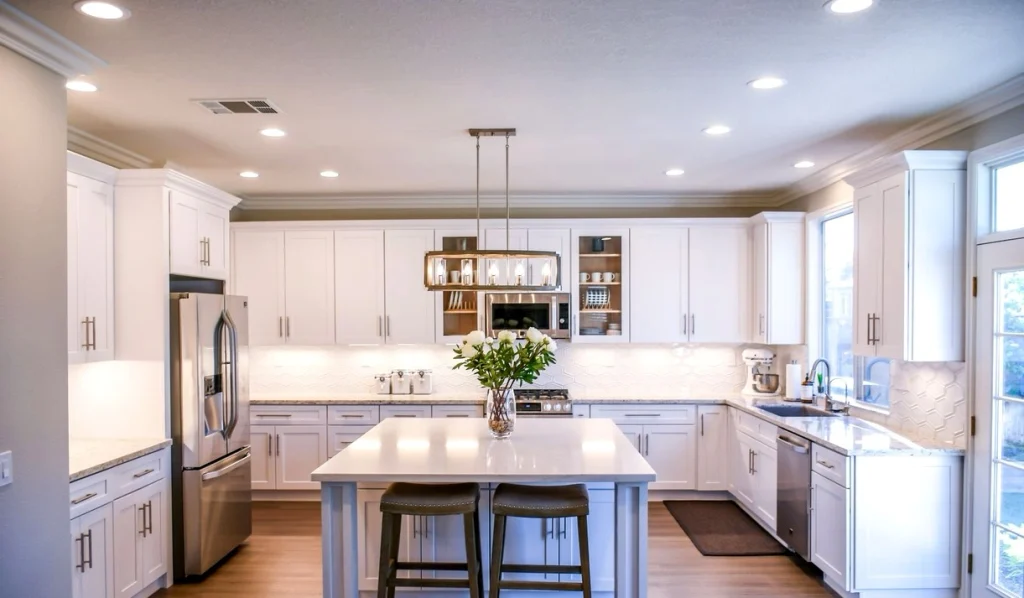
People argue about islands and quartz. Guests look at the doors.
Flat fronts still read as modern—Handleless, or a slim integrated rail. Shaker can work if the frame is thin and the colour is current. A chunky raised panel will fight you. I would rather live with a simple painted door and good hinges than a fashionable flute running across every single unit. Texture in one place is interesting. Texture on every door starts to look like a product shot from last spring.
Matte paint hides more than gloss. Gloss bounces light, which helps a dark galley, and it also shows the smear from whoever last opened the cereal cupboard. You already know which one you will actually wipe.
If the budget will not stretch to new carcasses, change the doors and the handles and stop there. New handles alone will not save a tired kitchen. A tired kitchen with old brass knobs and a new quartz top looks confused. Pick one metal and stay with it. Mixed metals can work. Mixed metals plus mixed woods plus a busy tile usually cannot.
A Saturday in a charity shop will turn up better hardware than many multipacks online. Lamps and pulls sit on those shelves longer than the furniture does. A heavy base with a rotten shade is still a six-dollar lamp. I’ve already written about that hunt in 20 thrift store home decor ideas.
Worktops and the splash: pick a surface you will not baby
Quartz is popular for a reason. It doesn’t stain like marble, and it doesn’t need the sermon that comes with wood. If you cook with oil and lemon, that matters more than the veining in a magazine.
Marble is beautiful, and it etches. I have watched people choose it, then hover over the worktop with a cloth like they were nursing a piano. That is no way to make dinner.
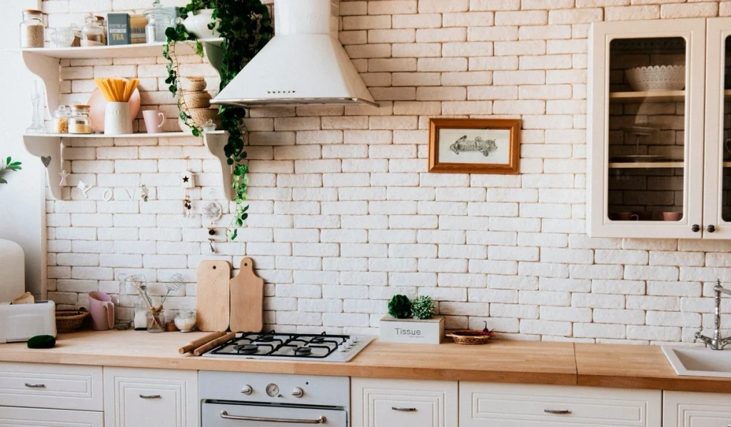
The kitchen backsplash does not need to be a statement wall. A quiet tile you can wipe after tomato sauce is a better friend than a herringbone you will hate in eighteen months. If you want one moment, put it behind the hob and keep the rest of the run simple. Floor-to-ceiling slab in the same stone as the worktop looks expensive because it is. A painted wall behind open shelves looks expensive if the shelves are sparse.
Lighting is where a cheap kitchen gives itself away.
Overhead downlights on their own make everyone look ill. You need three kinds of light, and you do not need an electrician to start.
Under-cabinet strips are the one upgrade I’d do before new tapware. They light the board. They also stop the upper units from turning into a dark shelf after six in the evening. Rechargeable ones exist if you rent.
A pendant over the table or island should hang low enough to feel like a lamp, not a ceiling decoration. Too high and it does nothing. Too low and you bang your head when you stand up from a stool. Measure with a friend sitting there. Ignore the drawing.
Warm bulbs. Not the blue-white that makes chicken look grey. If the rest of the room is wood and plaster, cold light fights it.
A small modern kitchen is a different job.
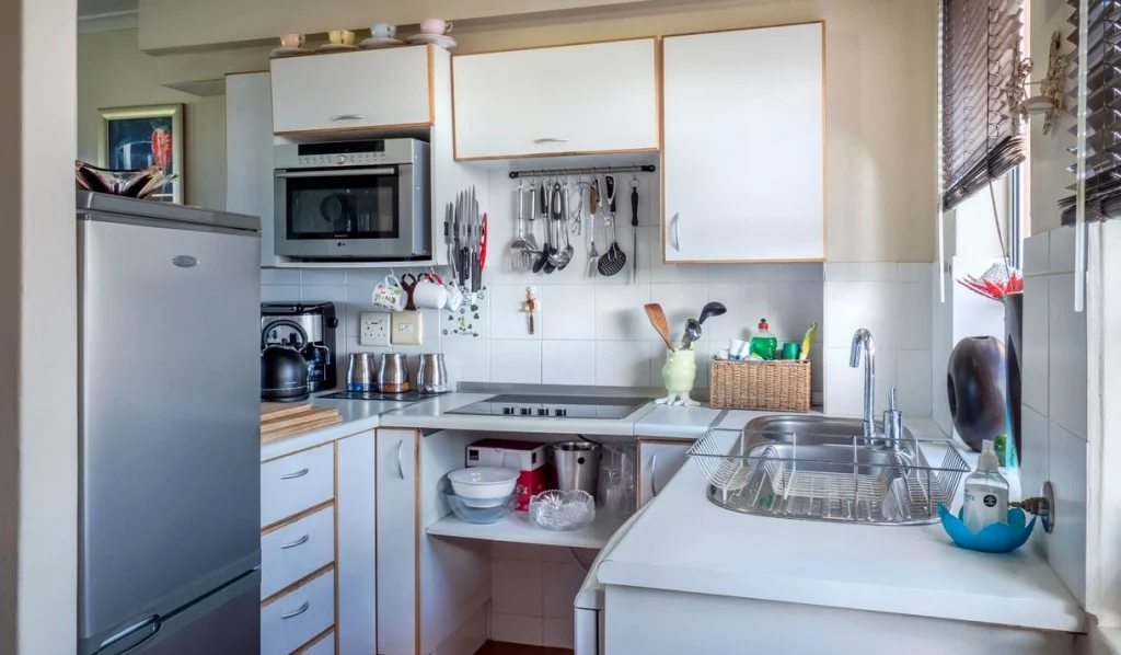
A small kitchen does not become modern by adding an island. It becomes cramped.
Take the cabinets to the ceiling. The gap above the wall units is wasted, and it collects dust you can see from the door. Use the top row for the stuff you need twice a year.
Skip the upper cabinets on one wall if the room is dark and you can live with a rail and a few hooks. Visual quiet is worth more than one extra cupboard of mugs you do not use.
Keep the worktop as clear as you can stand. The toaster can live in a cupboard if you only use it at breakfast. I know that sounds precious. It is also the difference between a galley that feels tight and a galley that feels finished.
A compact breakfast bar against a wall will do what a tiny island cannot: give you a place to sit without blocking the fridge door.
Kitchen islands: only if the walkway survives
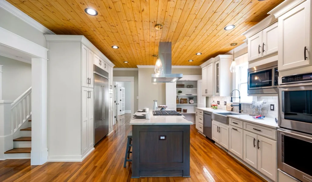
If you cannot keep roughly a metre of clear floor around the island, do not put one in. You will hate it by the second week, when two people try to pass, and someone ends up against the oven.
Where it fits, treat the island as furniture, not a block of cabinetry. A wood base under a stone top is enough contrast. Waterfall edges look dramatic, and they cost a slab’s worth of extra stone. Fine if the money is there. Not a requirement.
Seating on one side only. Four stools in an already busy kitchen is a restaurant that forgot the customers.
Kitchen storage that still looks modern on a Tuesday
Modern kitchens fall apart the moment the post arrives. A shallow tray by the door. A drawer for the junk that used to live next to the kettle. Pull-out bins so the bag doesn’t lean against the plinth.
Open shelves work if you edit them: three things and a plant. Don’t display the entire white dinner service. The plant on the windowsill is doing more work than another jar of pasta. I wrote about letting the window decide what lives there in plants for home decor; kitchen sills are wasted on ornaments that cannot take the heat.
A pantry cupboard, even a slim one, will do more for the look of the room than a new splashback. Hide the cereal. Hide the oil. Leave the worktop for the work.
What I would not spend money on first
- A tap that needs a manual. A boiling-water tap is nice. It is not what makes the room feel finished.
- Smart fridges with screens. You already have a phone.
- Fluted everything. One fluted drawer front, maybe. The whole run, no.
- Matching the kitchen to a trend colour you saw last month. Paint is cheap. Cabinets in a colour you will outgrow are not.
If you only have a weekend
Do the light first. Then the handles. Then clear half of what is sitting out.
Paint the wall behind the cooker if the tile is sound but dated. A tester pot will tell you in an afternoon whether the room can take a deeper colour.
Put one decent stool at the end of the run instead of four cheap ones. Put a cloth on the table if you eat there. A kitchen that is used will never look like the photograph, and it should not try.
A modern kitchen, in a house people actually live in, is just a room that has been edited. The lines are quieter. The light is warmer. The mess has a drawer. That is the whole job.