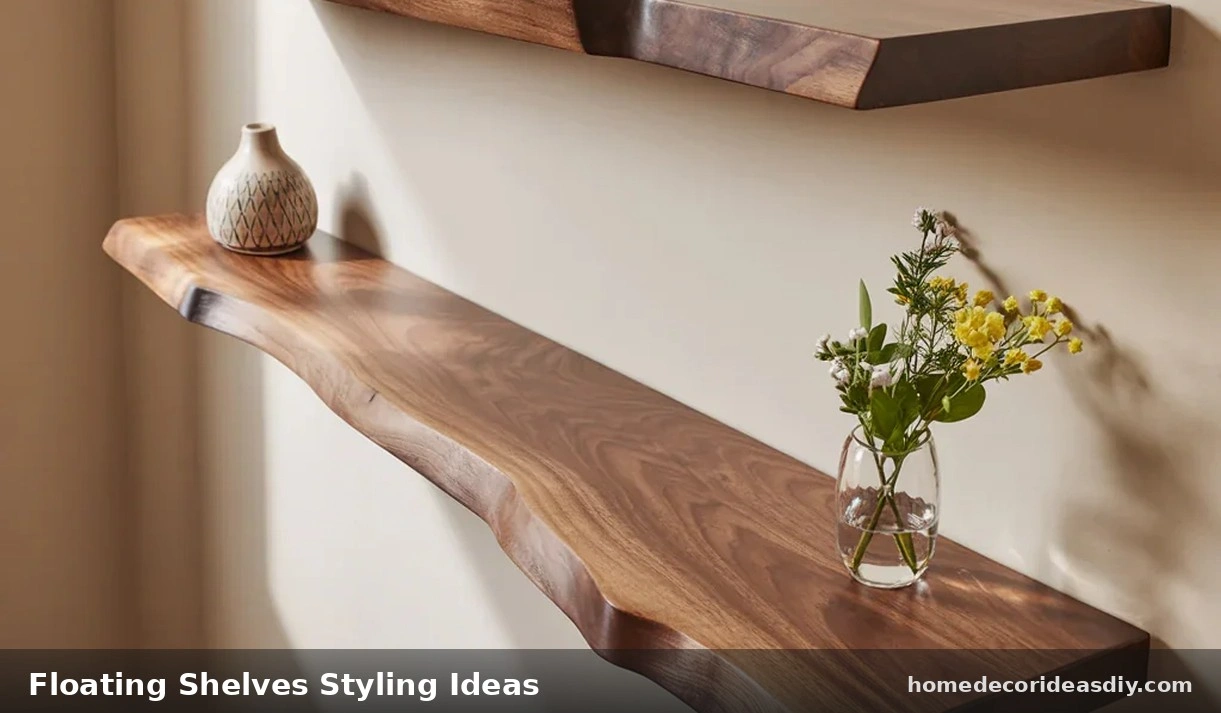
Three items. Evenly spaced. Same height. One per shelf. That’s what almost everybody does, and it’s why the shelf disappears into the wall instead of doing anything.
Floating shelves styling ideas that actually hold up start from the opposite place. Odd counts, not even ones. Different heights, not matched ones. Some space you… leave, even though it feels wrong to leave a shelf half-bare when you could put something on it.
Floating Shelves Styling Ideas That Break the Even-Spacing Habit
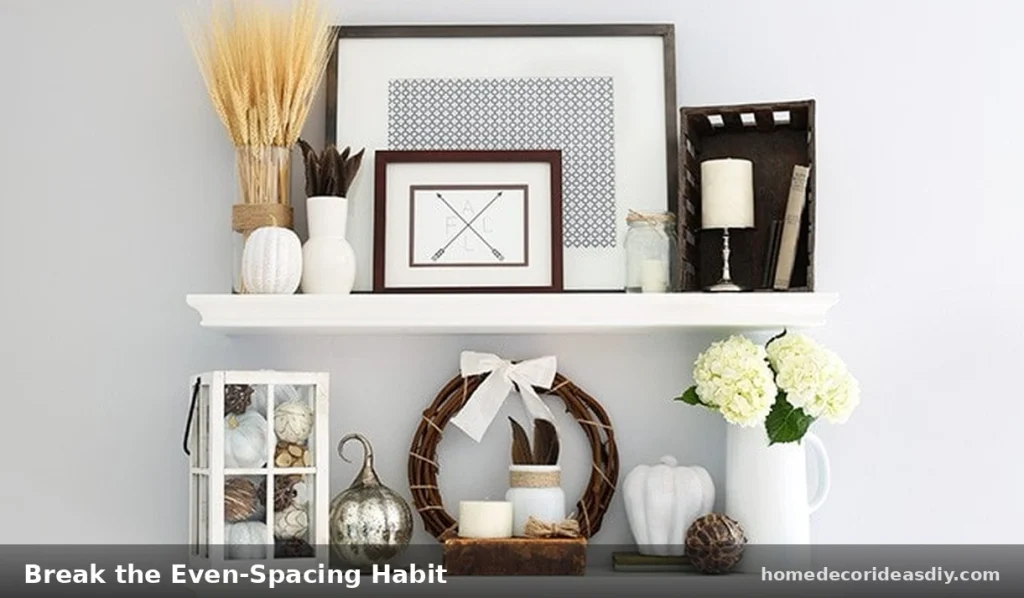
Two objects on a shelf look like bookends with nothing to hold up. Three objects spaced the same distance apart look like a store shelf, everything facing forward, everything tidy. Your eye doesn’t land anywhere because there’s nowhere for it to land.
Odd numbers work better, and it’s not some rule from a design textbook; it’s just how eyes work: a cluster pulls attention, and a straight row doesn’t. Five items grouped three-and-two beats five items lined up evenly every single time, and if you don’t believe it, try it on your own shelf for a week.
Height matters as much as the count does. Put something short in front of something tall instead of keeping the whole row at one level. A vase behind two stacked books, with a small print leaning against the wall rather than hung straight and centered, does more than three random objects spread out evenly ever will.
Check a shelf you’ve already done. Same height across the board, gaps all about equal? That’s probably the flat version, the one that doesn’t hold anyone’s attention past a glance.
Splitting One Shelf Into Thirds
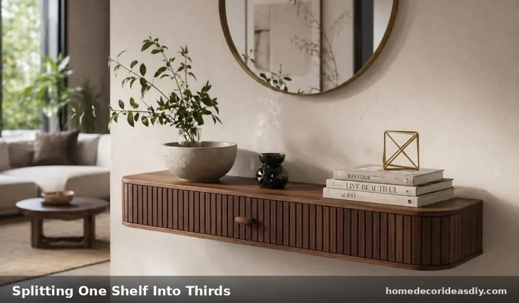
Take a 36-inch shelf over a console table in a narrow hallway; this works as a mental model even if your shelf’s a different size.
Left third, one taller piece. A vase, roughly ten inches, pushed toward the wall side rather than sitting in the dead center of its own third.
Middle third, two or three books stacked flat, spines facing out, something small on top of the stack, a stone maybe, or a little dish for keys.
Right third, mostly nothing. One low object if anything at all. The space does more work here than a fourth item would, which sounds backwards until you actually see it done.
Kitchens want the same zoning, different materials though, cookbooks not decorative ones, an herb plant you’ll actually water and use, not a plastic stand-in, one working object like a utensil crock pushed to one side instead of centered dead under the shelf’s middle.
Where This Goes Wrong Most Often
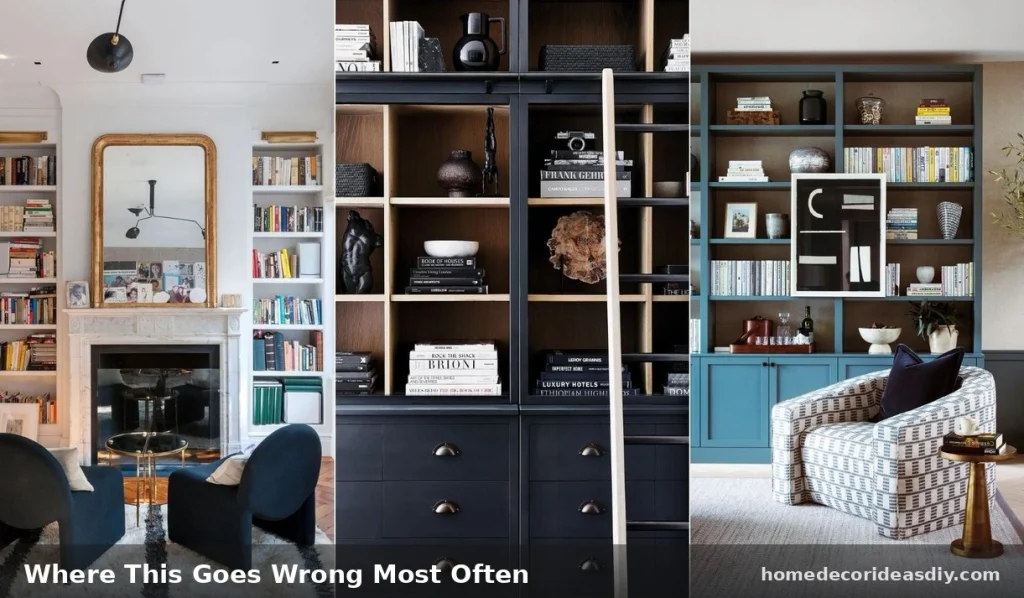
Fixed spacing no matter what’s going on the shelf. A shelf holding something tall needs more room above it than one holding flat books. Figure out the tallest object first. Set the gap around that. Most people measure the wall first and shop after, which is backwards.
Centering everything. Centered objects photograph clean and look dead in a real room. Push weight toward one end, let the other end breathe.
Cramming a long shelf full because space feels wasted. A four-foot shelf doesn’t need six things sitting on it; two or three with real gaps between them reads better every time. Tempted to add a fourth object because a shelf looks sparse? Pull the existing three into an off-center cluster first and see if that fixes it before buying anything new.
Texture Over Color Matching
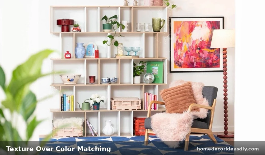
Ceramic next to a woven basket next to a matte frame, that reads intentional even when the colors don’t match at all. All-glossy or all-matte groupings flatten out they kind of disappear into the wall behind them.
One thing that helps: pick a single material, brass, dark wood, whatever, repeat it at least twice across a whole wall of shelving so there’s an anchor point tying separate shelves together. Let everything else vary.
Plants earn a spot, but placement matters more than the plant itself. A trailing pothos breaks up the shelf’s flat horizontal line by spilling down past the edge. An upright rigid plant in that same spot adds another straight line to a wall that’s already got plenty.
Leaving a Shelf Empty on Purpose

Skipped constantly, this one. Three stacked shelves don’t all need the same amount of stuff.
Leave the middle one close to bare, one small object off to a side, and it gives the eye somewhere to rest between two busier shelves above and below. Feels wasteful at first. An empty shelf done on purpose reads more expensive than one packed with five things fighting for attention, though.
Before you drill into anything, Better Homes & Gardens covers mounting height and spacing basics worth a look first. For load limits and shelf types before committing to a wall, the general shelf entry on Wikipedia has the structural basics most styling guides leave out entirely.
Still feels wasteful to leave a shelf half-empty, if I’m honest. But the shelves people actually notice in a room are rarely the fullest ones in it.